This is my style model for my content page. The layout of the photos encouraged me to do the same however I didn't do a size difference. The colour scheme was basic, this gave me the idea to have a similar scheme although it changed throughout my progress.
This blog will be based on my A-Level Media Studies course. I'll be uploading my research, videos, planning and my final product.
Thursday, 30 January 2014
Style Model - Front Cover
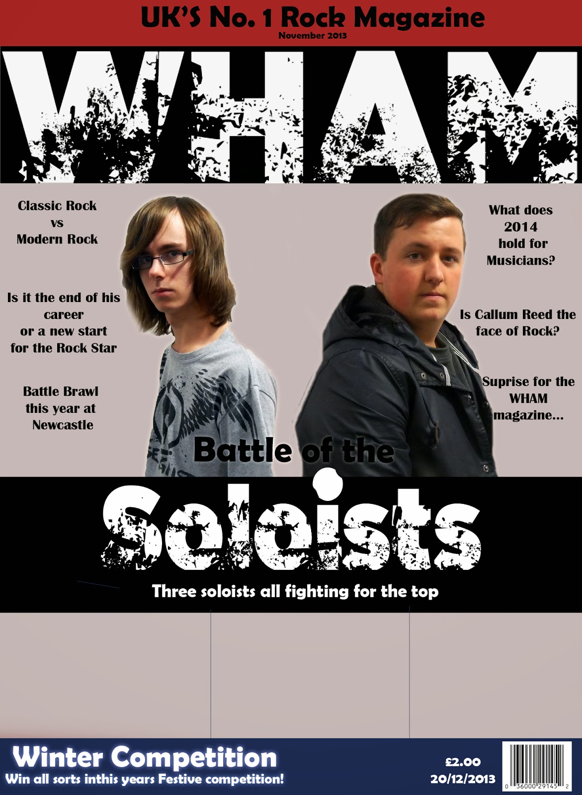
These two are my style models for my front cover. The main stories model in the centre, left cover. Three models together, right cover.
Article, continued
I've replaced the photo I had originally, experimenting how it looks on the page. I've also used my WHAM logo plus changing the Exclusive into Century Gothic text like my other titles.
Article
'WHAM Exclusive' is a filler for my main logo to be placed, this is only the rough draft of my double page spread article. I've added an image of my model however not sure whether to use this image or another.
Article - Double Page Spread
This is my Double Page Spread Article so far. I'm currently sorting out a picture of my main model, Joe, for this article to fill the space underneath the Q+A. I may move the image another position, I'll look at other double page spreads to see any inspiration.
Wednesday, 29 January 2014
More photos I didnt use
This photo was for a different type of story that wasn't based upon more than one soloist so it didn't work.
Both people are smiling and lost concentration when the photo was taken.
Connor's hair blocked his face also the position he's in with the guitar.
Monday, 27 January 2014
Content Page Update
This is my content page so far. It's nearly finished however I need to add two images where there's space next to the two paragraphs on the left side. The pictures of the modals have a white background behind them, I've done this for the image to stand out on the page also, below each image I have added short information of each story to advertise them.
Thursday, 16 January 2014
New Front Cover - Final
What's New?
- New Colour Scheme
- Layout
- Font
- Twitter and Facebook logo's
- Most important news highlighted (circle and square)
- Three models
- More Space Used
Content Page Update
After the new front cover been made, I kept the original layout of my content page. The only difference I have is the colour scheme, following the front cover, and also the font. I'm uploading the photos on my content page and then adding text giving the reader information for each story.
Update on my work
After uploading and editing the photos of Joe, a lot of progress was made due to having all the models on the front cover. After experimenting with backgrounds, I came across two colours that took over the page, over the black boxes that had text. This looked a whole lot better and different to my original plan. I saved the original and created an alternative cover with new font, colour scheme and layout. This is nearly finished, after I do a few more edits with font appearance.
Sunday, 12 January 2014
Update on the Front Cover
Subscribe to:
Posts (Atom)


